
Layouts in pictures
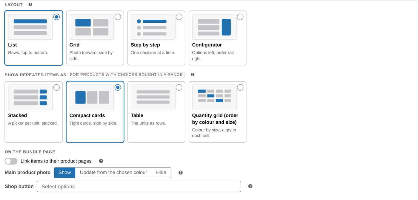
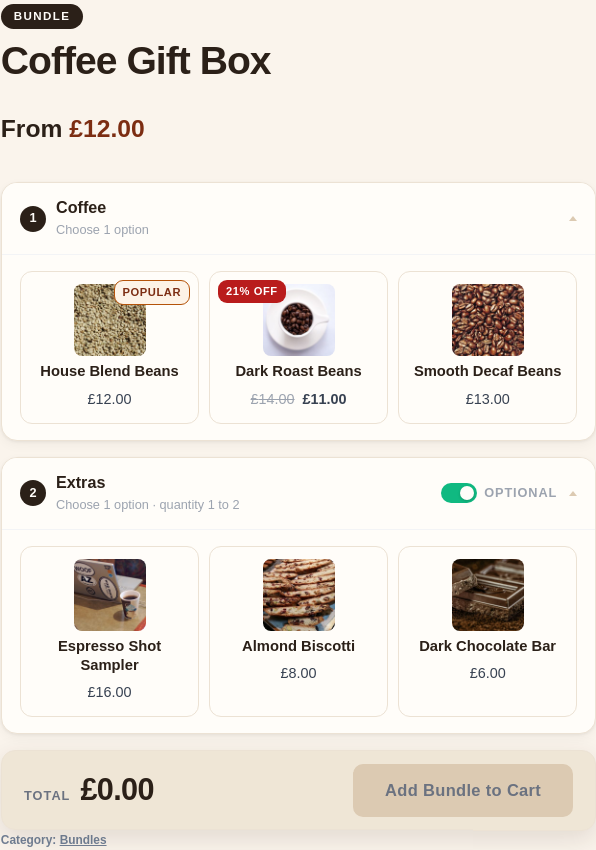
Two settings shape how a bundle looks, and they work independently:
- Layout sets how the whole bundle is arranged on the page.
- Multiple items sets how a single item bought in several units is shown.
Both live at the top of the Bundle Items tab. Below is each option, the setting that produces it, and how it looks (shown with a real hoodie that has colours and sizes). For when to pick which, see Layouts & which to use.
Where you set these
Section titled “Where you set these”When you edit a bundle, the controls sit at the top of the Bundle Items tab: pick the page Layout on the right, and Multiple items (how a repeated item is shown) on the left. Every option below is just one choice in these dropdowns.
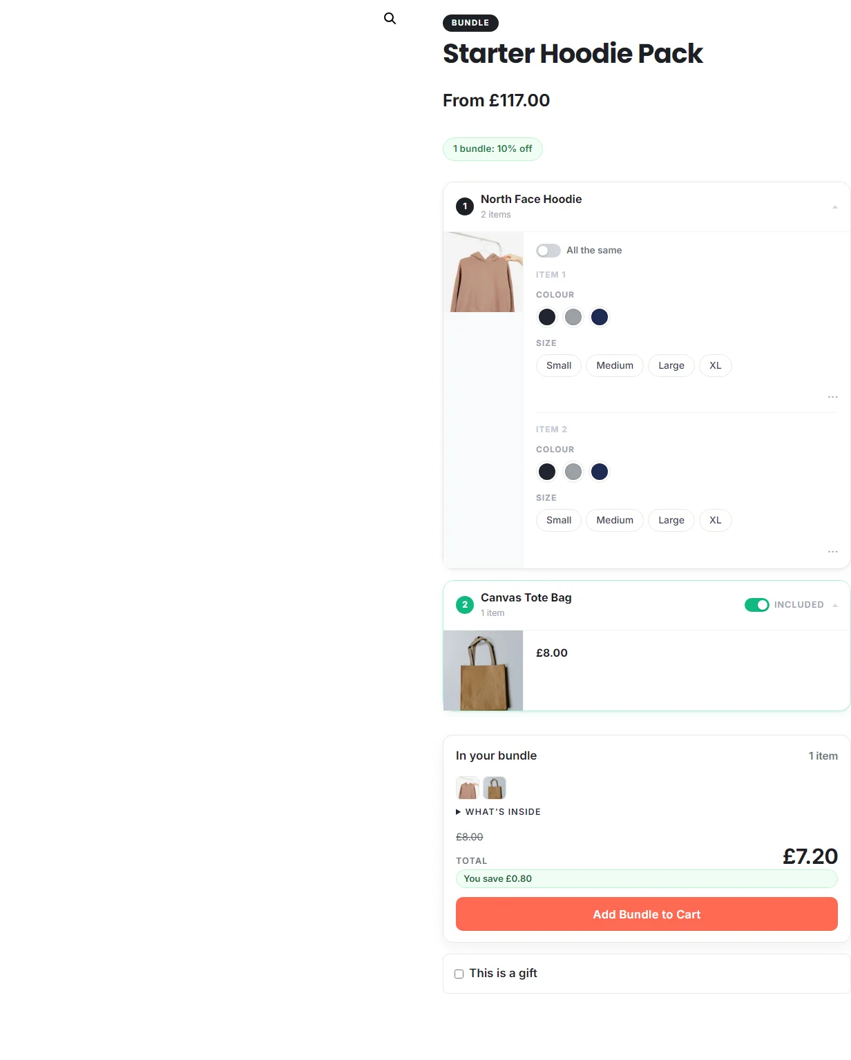
Page layout
Section titled “Page layout”To get this: set Layout to List.
To get this: set Layout to Grid.
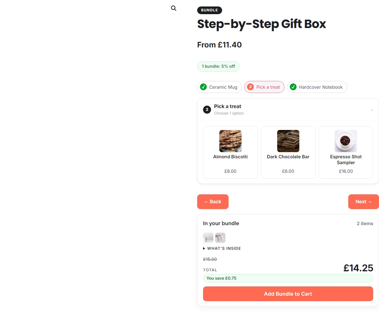
Step by step Pro
Section titled “Step by step Pro”To get this: set Layout to Step by step.
Configurator Pro
Section titled “Configurator Pro”To get this: set Layout to Configurator.
How a multi-quantity item shows
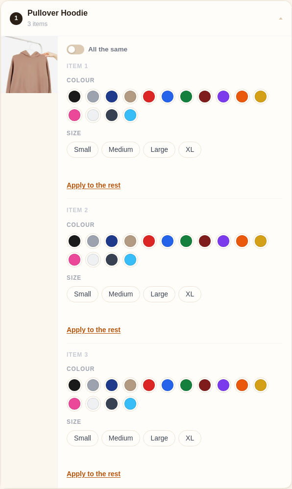
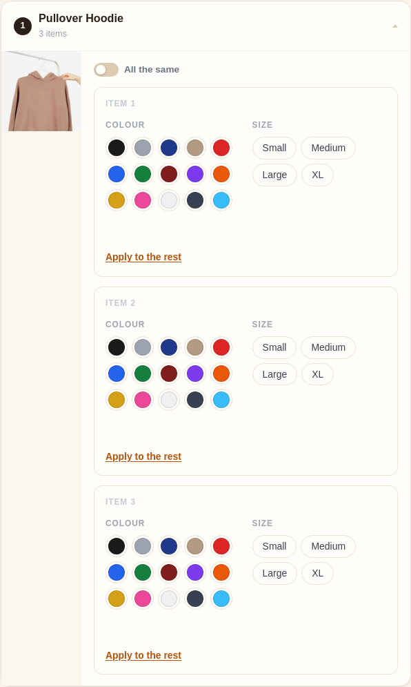
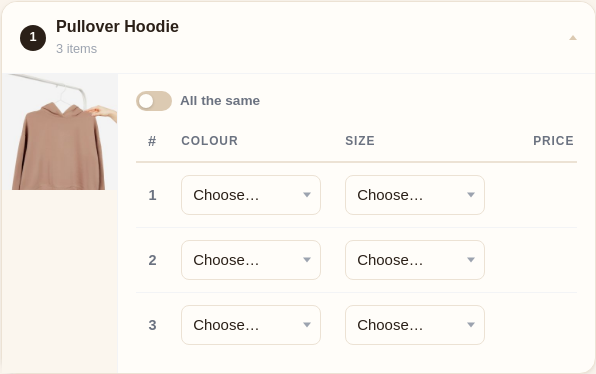
Section titled “How a multi-quantity item shows”When one item is bought in several units (a three-pack, say), Multiple items controls how those units appear. It only changes a variable product bought in quantity; simple and single-unit items always look the same.
Stacked
Section titled “Stacked”To get this: set Multiple items to Stacked.
Compact cards
Section titled “Compact cards”To get this: set Multiple items to Compact cards.
To get this: set Multiple items to Table.
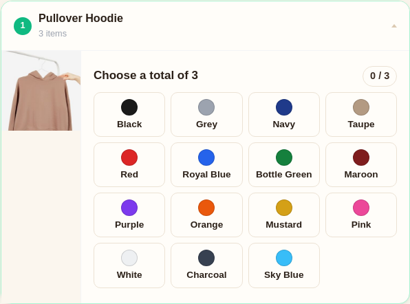
Quantity grid Pro
Section titled “Quantity grid Pro”To get this: set Multiple items to Quantity grid.
Different kinds of product
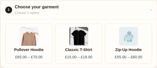
Section titled “Different kinds of product”Every shot above uses a product you choose (a variable hoodie), which the customer configures. Two other cases are worth seeing:
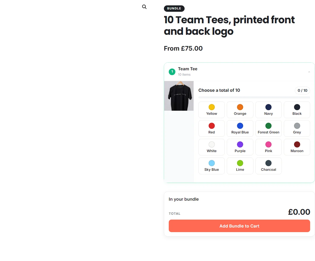
A choice slot Pro
Section titled “A choice slot Pro”To get this: add the item as a choice slot instead of a fixed product.
Colour swatches
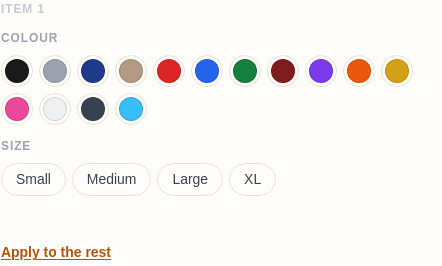
Section titled “Colour swatches”To get this: give the colour attribute swatch colours, or let them fill in from the name.
Mix and match
Section titled “Mix and match”Because the two settings are independent, you can combine them freely: a List page with a Quantity grid item, a Grid page with Compact cards, and so on. Pick the page layout for how the bundle reads as a whole, then the Multiple-items display for how a repeated item is filled in. Not sure which? The Layouts & which to use page has a quick recommendation table.